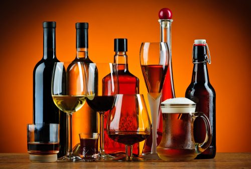
5 Tips for Designing Cool Alcohol Bottles
Glass bottles cost 30 cents. It sounds like an afterthought in production – cheap enough not to lose any sleep over.
But it shouldn’t.
Your bottles are your customer’s first interaction with your products. They’d better draw the eye, and they’d better tell a promising story.
Read on for some tips that’ll have you designing cool alcohol bottles in no time.
1. Embrace Shape and Structure
Think outside the traditional cylindrical bottle and experiment with structure. Consider asymmetrical designs, new geometric shapes, or having the bottle mimic a vital ingredient. For instance, a tequila bottle might take the form of a cactus, or a vodka bottle might imitate the crystalline structure of ice.
Keep functionality in mind, as well. The bottle needs to be easy to grip and pour from – otherwise, it will frustrate customers.
2. See the Bottle as More Than the Packaging
Eye-catching package designs seamlessly fuse art with packaging.
Don’t see the bottle as a mere vessel, stuffed into a beer packing machine on the assembly line. Consider how the colour of the glass can enhance the product’s appeal and how the label tells the brand’s story. Your bottle’s form can symbolize your brand’s values or the uniqueness of the beverage.
Like above, don’t forget the bottle’s primary purpose: to store and preserve your product. It must be resistant to light – and durable enough to survive a knock or two.
3. Play with Materials and Textures
The use of unique materials can bring a tactile dimension to your alcohol packaging, making it more memorable. Glass is the traditional “go-to” choice for alcohol – but don’t shy away from materials like ceramic, metal, or even wood.
Adding texture to the label can bring a further sensory experience to the customer. Using textured paper or embossing your brand’s name are two examples that add a layer of complexity to your design.
A rustic, artisanal whiskey might be best presented in a wooden bottle with a textured label, while a sleek, modern vodka might look best in a glass bottle with a smooth, metallic label.
4. Include Functional Elements
Functional elements add some excitement to your alcohol bottles. A bottle cap that doubles as a shot glass or a jigger is handy for a customer looking for easy cocktail ingredients. A label that peels back to reveal a classic recipe or two adds a layer of mystery.
These elements make the package more practical and create an interaction between the customer and the product.
Remember that a functional element shouldn’t get in the way of the product. It shouldn’t complicate the user’s experience, but enhance it.
5. Keep It Simple
Sometimes less is more. “Cool” alcohol bottles don’t have to do everything. Elegant and minimalist types of packaging are often the best.
Play with subtle variations in colour, shape, or typography to create striking designs that do more with less.
By focusing on simplicity and refinement, you can highlight the quality of the alcohol and the sophistication of the brand: Minimalism means deliberate design, not a lack of creativity.
You can also learn about: Marriott Vacation Club Points Chart
Cool Alcohol Bottles Stand Out
It’s both fun and challenging to design cool alcohol bottles.
A winning design is one that blends form with function and marries the result with your brand’s identity. With creativity and a little innovation, you can design bottles that are impactful – and leave the customer wanting more.
Did you find our article helpful? Check out some others in our marketing category if you have a few minutes to spare!


